Responsive vs Adaptive Theme
SCHLIX CMS allows you to customize your site using either responsive or adaptive theme. Responsive theme is usually more common and is usually preferred by most web designers, with many notable CSS frameworks such as Twitter Bootstrap, Zurb Foundation, Semantic UI, or Pure CSS available for use. By default, SCHLIX CMS uses Bootstrap Twiiter framework for its frontend theme and its built-in template.
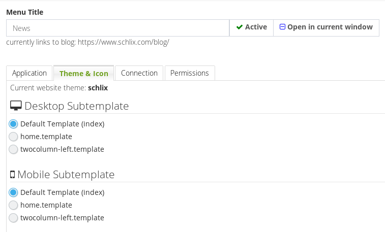
However, the system also automatically detects whether the client is on a mobile site and if you want to choose to use adaptive theme instead, you can customize it with a separate view template file (must end with .template.php) inside your theme folder. You must also specify which mobile theme subtemplate to use in the menu editor for each menu item for this to work correctly.